

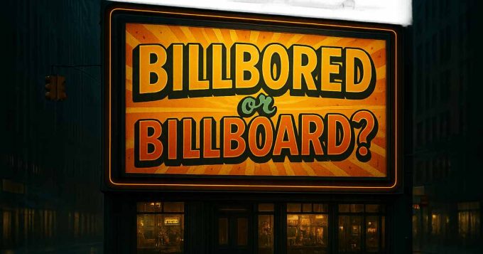
OOH Reviews
Imagine a world of gold, treasure, and flying objects, or even enchanted poppy fields. But here in Pakistan, the real spectacle isn’t fantasy – it’s the billboards taking over!
They tower above the skyline, louder than a Karachi traffic jam and flashier than a shadi stage. Forget streets paved with gold, ours are lined with an endless parade of billboards, each more outrageous than the last.
Now, aside from being an editor and a writer, I also have a formal education and career background in creative design. And trust me, that part of my brain is always on. Whether it’s the packaging of a biscuit or a billboard looming over a roundabout, I can’t help but analyse and sometimes silently judge, every design I see.
Billboards are the loudest storytellers on the streets, bold, unmissable, and always selling something. In a country bursting with colour and chaos, only the sharpest ads break through the noise, turning heads and making an impact. The rest? They fade into the background like a bad haircut you regret instantly, forgettable, awkward, and begging to be redone.
So, what makes some billboards unmissable while others go unnoticed? What’s that secret ingredient that turns an ad into a head-turner?
Join me as I explore the fascinating, bizarre, and often cringeworthy world of Pakistani billboards, decoding designs, unpacking the psychology, and figuring out what these ads say about us. Visual impact, emotional pull, that mysterious X-factor, I’ll judge it all. And yes, I’ll be brutally honest!
Xpert Kitchen Appliances
Xpert kicks off its billboard campaign with a sleek, high-end display of its kitchen appliances. First impressions? It’s glossy, modern, and definitely pushing the luxury angle – those golden letters are doing their best to make a statement. On the plus side, it grabs attention effortlessly. Bold typography and a strong contrast ensure you won’t miss it, even at high speed. And who doesn’t love a good deal? That ‘FLAT 20% OFF’ is a magnet for bargain hunters. That said, it lacks emotional impact – about as engaging as a kitchen appliance manual. The focus on modernity and efficiency might appeal to some, but it won’t leave a lasting impression. And while it’s well-executed, it doesn’t exactly reinvent outdoor advertising. The white background provides breathing space, but overall, it’s more functional than groundbreaking.

Carient PSO
Carient’s billboard is a roaring success! Bold golden letters “Conquer with Carient”, set the tone for adventure, strength, and power. The cave entrance, glowing with a warm sunset, is stunning. But the real showstopper? A majestic lion, sculpted from the cave itself, sitting in a powerful pose. The lion dominates, cleverly overshadowing the product, a smart move by PSO, proving their creative marketing prowess. The Carient engine oil bottle pops against the cave’s darker hues, ensuring it grabs attention. This billboard exudes adventure and empowerment, inviting viewers to experience Carient’s strength and performance. PSO, you’ve outdone yourselves, hats-off!

Emirates
Emirates, you almost had me! That deep red backdrop and bold logo oozing luxury and adventure. And who wouldn’t want to fly to over 1,800 cities? But here’s the thing, I was a little disappointed (Okay, outraged might be more accurate!) when I saw the all-female crew on the left. Don’t get me wrong, they’re lovely, but where’s the diversity? Where’s the pilot? A male crew member? In Pakistan, where patriarchy still holds strong, this feels like reinforcing a stereotype. Are stewardesses really the only ‘better’ part of ‘Fly Better’? Surely, better service isn’t just about a smiling female crew. I’m not asking for much, just a bit of representation. A pilot, a mix of crew members – something that says inclusivity. Emirates, you can do better. Be bold, be global, and show us you stand for diversity and equality!

Slice Mango
Slice Mango is cooling things down with a vibrant billboard that feels like a tropical escape. The lush green background screams freshness, while “Pure Mango Pleasure” in bold white text adds a touch of elegance. The real showstopper? A young woman biting into a mango, radiating pure bliss. The sensual vibe is strong, almost like she’s inviting you to indulge. The playful yellow font and splashes of orange at the bottom perfectly capture the juicy essence of mangoes, with that subtle green mango text adding a nice touch. Now, the downside, it’s predictable. We’ve seen this beautiful woman enjoying a refreshing drink concept a million times. Same poster, different model – zero originality. Where’s the creativity? Most Pakistanis enjoy juice with family and friends, not in some dreamy, solo paradise. It’s time to retire the age-old sensuous poster girl and go for something fresh, juicy, and actually relatable!

LIVITY Supplement
Livity’s billboard is bold and attention-grabbing, with a deep purple backdrop that demands a second look. The brand name in crisp white letters exudes freshness, while Balanced Nutritional Supplement gets straight to the point. The clean design is easy to digest (pun intended), with vibrant colours and icons clearly highlighting the product’s benefits. That orange geometric shape on the left? A nice dynamic touch. But here’s the issue, it feels too clinical, more like a medicine label than a lifestyle-enhancing supplement. Where’s the spark? The emotional pull? A product meant to promote vitality should look lively! Real-life images of people enjoying life would’ve made it more engaging. Instead, this design is a bit of a buzzkill. Come on, Livity—you can do better!

Cadbury Mini Fingers
Cadbury’s Mini Fingers are back, and they’re bringing biscuits to the party! The royal purple backdrop feels like a warm hug, inviting you to indulge in chocolatey goodness. And let’s be real – who can resist a sweet deal? Rs. 20, anyone? The design nails it, with bold text, an irresistible cluster of Mini Fingers, and a clear nod to Pakistan’s love for sweets. Whether it’s a birthday, Eid, or just a random Tuesday, these treats fit right in. Does the billboard deliver? Mostly, yes! It’s eye-catching, communicates the product well, and taps into our communal love for chocolate. On the downside, all that purple is a bit much, and the ‘royal’ vibe borders on pretentious. Also, if biscuits are the star, why not show some? Not everyone reads English, and a visual cue would make it more accessible. Just saying chocolate should be for everyone, Cadbury!

Rooh Afza
Rooh Afza, the soul-refreshing drink as red as our blood, is back with a billboard that’s got everyone talking. The design is warm and inviting, with Chal Mere Laal elegantly scripted in white against a rich, dark background. The brand name sits stylishly above. The imagery is cosy – a family of five enjoying drinks together. But, Rooh Afza, we need to talk. Why is Dad on the ‘head chair’ while Mum sits beside him on the sofa? Why are the daughters on the floor while the son sits comfortably next to Mum? This setup reinforces tired patriarchal norms. Newsflash: daughters deserve the same position as sons. And in this context, Chal Mere Laal hits differently (need I spell it out?). Next time, how about showing a family where everyone is treated as an equal? Now that would be a truly refreshing message!

image Clothing
image is serving serious style with this elegant billboard. The soft green background feels fresh and calming, while the brand name in sleek white typography screams modern chic.
The three models strike artistic poses, each flaunting effortless elegance. But the real scene-stealer? That giant teacup. Um, image, what’s the tea (pun intended)? Is this a tea party collection, or can we just lounge in these outfits with a cuppa? Props for tapping into Pakistan’s tea obsession, but that teacup design? A bit “meh”. And overall, the vibe feels a tad dull. Still, image, you’ve got our attention – let’s see what you’re brewing next!

Dove Shampoo
Dove is back with a billboard that’s got us swooning. The light blue background feels as fresh as a spring morning, and the smiling woman with her gorgeous curls radiate confidence and joy. We love the visual appeal; her hair is just wow! But Dove, let’s be real. This ad screams ‘for women only’, as if men don’t experience hair fall (newsflash: they do!). And why assume only women care about their hair? In Pakistan, that’s definitely not the case.
We’re not questioning Dove’s velvety goodness, but come on, how about a little inclusivity?

Vital Tea
Vital Tea is brewing up a storm with this vibrant billboard, serving warmth and nostalgia in a single glance. No models, no props, just tea taking centre stage. It’s like Vital Tea is saying, “We’re enough, and our flavour speaks for itself!” The patriotic vibe is strong! #ProudPakistani and ‘Pakistan is Vital’ hit right in the feels, a reminder that we’re vital too. And that rising sun behind the packaging? A perfect touch. Honestly, we’re struggling to find a flaw. Vital Tea, you’ve nailed it, kudos for a job well done!

Saima Group
Saima Group’s billboard is a snore-fest. We’re talking a plain white background, some green script, and… that’s about it. The design is as dull as a butter knife. Don’t get us wrong, the bold green number ‘40’ is attention-grabbing, but that’s where the excitement ends. It’s like the creative artists took a nap, and the architects got all the creative juice. We’re left staring at this blank message, wondering what it’s trying to convey. Is it about the 40 years of commitment? The residential buildings? Mall? The contact number? We’re blank. The only way to decipher this cryptic message is to call the number below. So, folks, if you’re curious, go ahead and dial. Maybe they’ll reveal the secrets of this underwhelming billboard.

TCL
TCL’s billboard is a showstopper! A massive screen displays a breathtaking sunset over mountains, making us want to dive right in. ‘Time To Go Big’ blazes across in bold white letters, and we’re feeling the hype. On the right, the TCL logo pops in red with the tagline ‘Inspire Greatness.’ Icons highlighting large screens, HDR, and QLED seal the deal.
But the real genius? Contrast. Tiny figures stand atop what looks like an army tank-thingy – yes, really!, dwarfed by the screen and vast landscape. It’s as if the sky itself is part of the display! TCL nails the luxury vibe, making us crave a screen as big as mountains. Who wouldn’t? You’ve set the bar high – now bring on the epic viewing experience!

Sooper
Sooper Biscuits nails it with this heartwarming billboard! With a rich brown background, bold white ‘Sooper’ lettering – it’s instantly inviting. But the real genius? A clever wordplay. Instead of writing ‘Khushi’ (happiness), there’s a blank space, prompting us to fill it in. And, of course, we all know the answer, ‘Khushi’ thanks to that catchy jingle now stuck in our heads! The faceless model, the biscuit in focus, the transparent glass instead of a mug – simply Sooper! It’s relatable, nostalgic, and oh-so-Pakistani. Biscuits with tea? That’s culture in a nutshell. With its rectangular board, wide image, and elegant design, Sooper makes us believe the missing piece of happiness is, indeed, that biscuit… and a hot cup of tea!

Lays
Lays, you’re sneaky! This billboard is a masterclass in psychological trickery. The same green as the packaging blurs the line, where does the packet even start? That spiral design, identical to the one on the pack, is pure genius. It’s like you’re hypnotising us into buying those chips! And let’s be real, who can resist “hypnotic flavour”? But seriously, that green is seared into our brains. You’ve hacked our subconscious, and next time we’re buying snacks… well played, Lays, well played!

Pepsi
Pepsi’s billboard is a thirst-quenching masterpiece! One side glows with golden-brown liquid, ice, and a crisp white can outline. The iconic logo pops, making our mouths water. The other side? A hypnotic swirl of Pepsi’s signature blues, with the can front and centre, boldly declaring: ‘New Stronger Pepsi’. It’s impossible to ignore! This is pure visual genius, warm fizz tempts our taste buds, while cool blues refresh our eyes. Pepsi, you’ve nailed it! The New Stronger Pepsi hits hard, kudos!

Shangrila
Shangrila’s billboard is a culinary masterpiece! The split background, rich red and neutral white is genius. The chef, divided between pro and home cook, brilliantly showcases how anyone can cook like a chef with Shangrila’s liquid seasonings. We love the outfit transition from a red chef’s coat to a casual white shirt, symbolising pro-to-home cooking. Blurred backgrounds subtly distinguish a professional and home kitchen, enhancing the story.
The food display, noodles and fried chicken has our taste buds tingling. And the tagline, “The Experts’ Secret Is No Longer a Secret,” cleverly highlights quality flavours for all. A masterclass in marketing, seamlessly blending the message, any kitchen, perfect taste. Shangrila, you’ve nailed it!


