
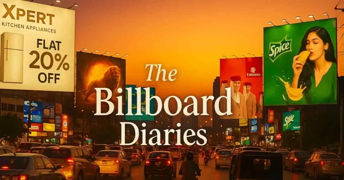
In a landscape where every surface is vying to sell you something, the real challenge isn’t being seen; it is being remembered. In this issue, we take a deep dive into the ever-evolving world of outdoor advertising, AKA billboards, where brands battle for attention across skylines, streets, and signboards.
Each review unpacks what works, what does not, and what makes you stop mid-step to actually look. From subtle rebrands to confident refreshes, it explores the delicate balance between clarity and creativity, because when done right, a billboard is not just an ad; it is a conversation with the city itself.
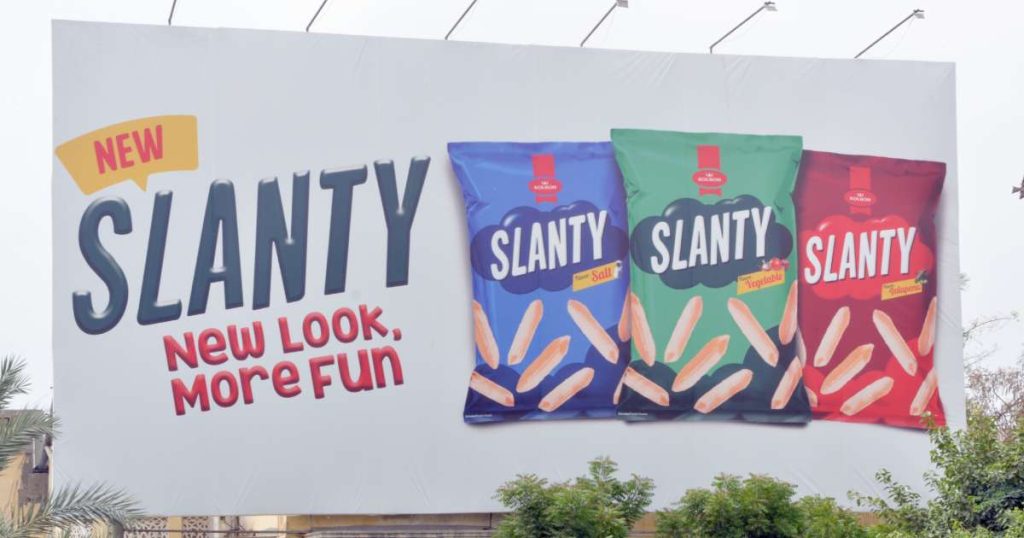
Slanty – New Look, More Fun
Slanty’s billboard is minimal, clean, yet colourful and fun. It is crisp, communicates effortlessly, and leaves no room for confusion. The visuals are tempting enough to make you crave a pack instantly and leave you thinking in the middle of the road, ‘I wish I had a pack right now’.
What is most admirable, though, is the balance between reinvention and nostalgia; they have refreshed the look without alienating loyal fans. It feels familiar yet new, playful yet simple.
The billboard does not overcomplicate, overpromise, or force curiosity; it simply informs. And that is exactly what good outdoor advertising should do. Sometimes, clarity is the most effective form of creativity.
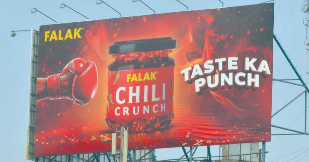
Falak Chili Crunch – Taste ka Punch
Now this is a billboard that makes you look twice. Everything you would expect from a product promising spice. The copy is cheeky and confident, and the design radiates heat before you even know what it’s selling.
It is fiery, bold and loud, but that is also where it slips: the product itself is a mystery. Is it a topping? A dip? It falls slightly short in clarity. While the visual impact is strong, it does not effectively communicate what the product is or how it’s intended to be used.
That missing context weakens the brand message. A little visual context could have turned intrigue into intent. Still, as far as eye-catching goes, Falak’s definitely delivering the “punch” part.
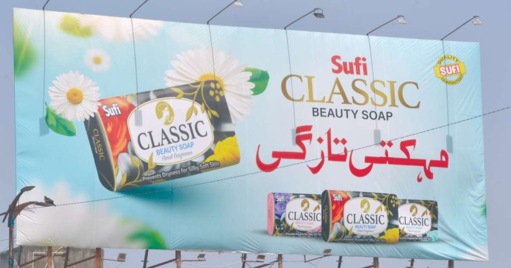
Sufi – Classic Beauty Soap
Sufi’s billboard is an ode to timeless simplicity. The bright colours, floral motifs, and bilingual text in Urdu and English come together beautifully to convey the brand’s essence.
It feels warm, nostalgic, and traditional. What stands out is the restraint; it does not pretend to reinvent beauty or be life-changing, it just reinforces what has always worked.
Its simplicity is sincere. The tagline complements the overall aesthetic, reinforcing the “classic beauty” theme without overwhelming the viewer. It is gentle, familiar, and evocative, a perfect example of how subtlety and old-school charm are still cool.
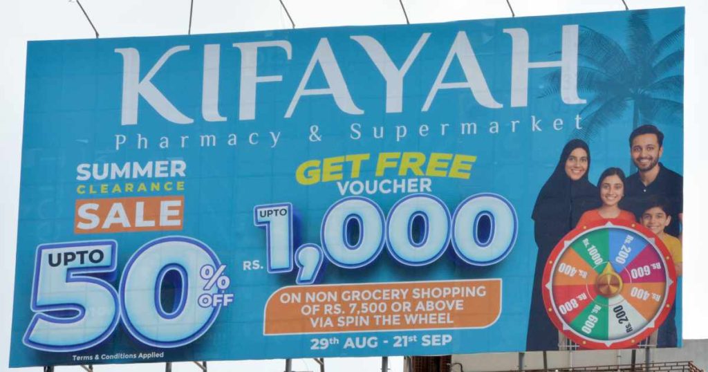
Kifayah Pharmacy & Supermarket – Summer Clearance
This billboard is the visual equivalent of opening 10 tabs at once. It is trying to say too much, all at once, and in doing so, says nothing clearly. The only way I can describe it is: as overcrowded, overstimulating, and borderline unsafe to process while driving.
The layout lacks in hierarchy, too many elements competing for attention: the family picture, the “wheel of fortune,” multiple fonts, and that tiny “up to” which instantly erodes trust. It is 2025; audiences can spot marketing gimmicks a mile away. Outdoor advertising demands instant comprehension, but here, the message is buried under visual clutter.
A cleaner design, one core message, and maybe a little breathing room would have made this far more effective.
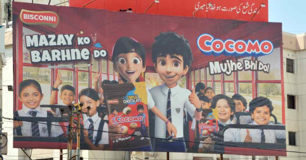
Cocomo – Mazay ko Barhne Do
This one leaves me divided. The concept of mixing animation with real kids is refreshing and playful, perfectly in line with Cocomo’s youthful spirit. The colours are vibrant and engaging, but the execution misses a few key notes.
The product itself is almost invisible; a close-up of that gooey, chocolate-filled biscuit would have sealed the craving, and even the packaging feels undersized, maybe a little too minimalistic.
Also, the layout in my opinion, is a little mislaid. The copy placement could be improved; left-aligned text flows better visually. A fun concept, but it needed a little more indulgence.
PSO – Blaze Xtreme
PSO’s Blaze Xtreme outdoor campaign is a strong example of the right kind of visual energy and brand consistency. From the towering building wrap to the illuminated street installations and the perfect lighting situation (the headlight). Every execution captures the adrenaline-driven spirit of the product. The sleek black visuals and dynamic display of heavy bikes parked roadside make it an engaging, experiential setup that draws attention for all the right reasons, especially from motorbike enthusiasts.
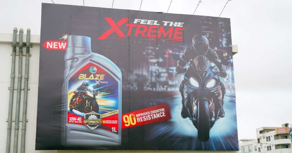
What makes it effective is its dual impact: by day, the deep black finish conveys power and sophistication, and it stands out against the beige of the concrete jungle. By night, the illuminated design transforms it into a striking display of motion and energy. This shifting visual tone reflects both strength, style, and smartness while ensuring the message is delivered to the right audience.
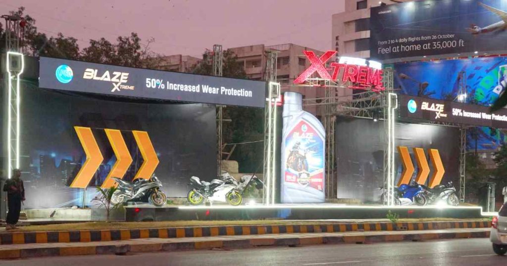
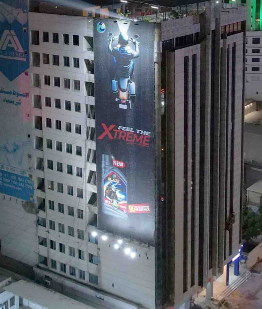
As Pakistan’s first API SP 4-stroke motorcycle engine oil, Blaze Xtreme positions itself not just as a performance product but as part of a lifestyle. With the tagline “Feel the Xtreme”, translated into powerful imagery and a real-world bike exhibition, PSO has executed an OOH campaign that connects directly with its core riders, those who live for the thrill of the ride.


