
In a world cluttered with flashing signs, some brands have figured out how to do less and mean so much more. The art of whispering rather than shouting. This is not just about catching eyes; it is about earning trust, sparking desire, and making every rupee of billboard marketing count. Dive in to discover how subtlety and strategy combine to create moments that linger long even after you look away.
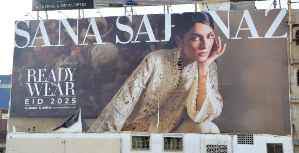
Sana Safinaz x Ayeza Khan
In a sea of over-saturated, hyper-styled fashion billboards, with blinding colours, too many models, and too much happening at once, this one stands apart. The lack of visual noise is an example of how minimalism, when rooted in strategy, elevates a brand’s presence. The focus shifts to the jora, the cut, the craftsmanship, the colour, everything is visible, not buried beneath chaos. Even the brand name benefits from the minimalism, standing out with quiet authority and luxury. The restraint does not feel like a lack of effort; it reads as a sign of confidence. This is fashion advertising growing up.
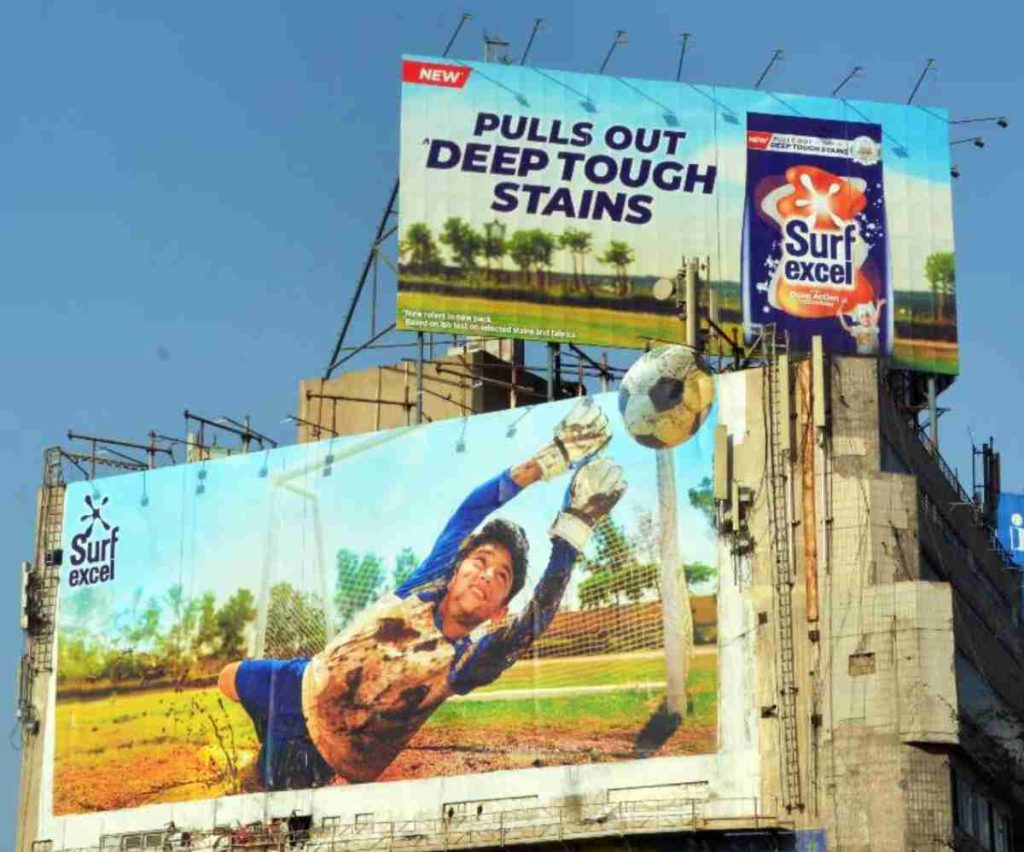
Surf Excel – Two Pictures, One Story
Now this is what we call a well-thought-out, well-executed out-of-home (OOH) campaign. There is no clutter, no over-explanation. It is told brilliantly through just two visuals. It is eye-catching, instantly engaging, and leaves a lasting impression. This Surf Excel billboard encapsulates everything the brand’s DVCs and TVCs strive to communicate; it is the brand’s DNA, all present and accounted for, except it does it in just two stills. It is impactful, simple and proof that when done right, outdoor advertising can say more by showing less. It is what you remember long after you’ve looked away.
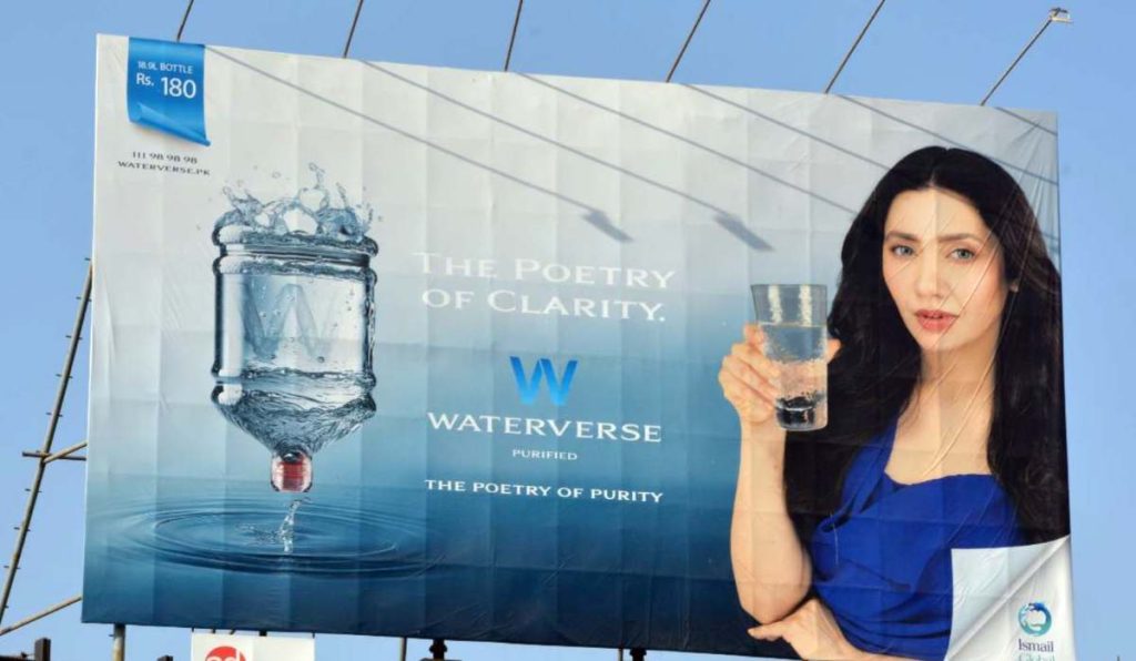
Waterverse ft. Mahirah Khan
On paper, this is a visual win, clean palette, celebrity ambassador, sensory cues aligned with the product; clean, cool and calming. It symbolises everything you want water to feel like: refreshing, pure and effortless. The ad is sleek and self-explanatory, doing justice to the product without saying too much. But it feels less like Mahirah Khan and more like an AI’s idea of her. Humanity dissolves in favour of flawlessness. And that, ironically, makes the whole thing feel a little parched. Because water is about realness, about life, about touch. This billboard looks stunning, yes, but it forgets that consumers do not thirst for perfection. They thirst for connection.
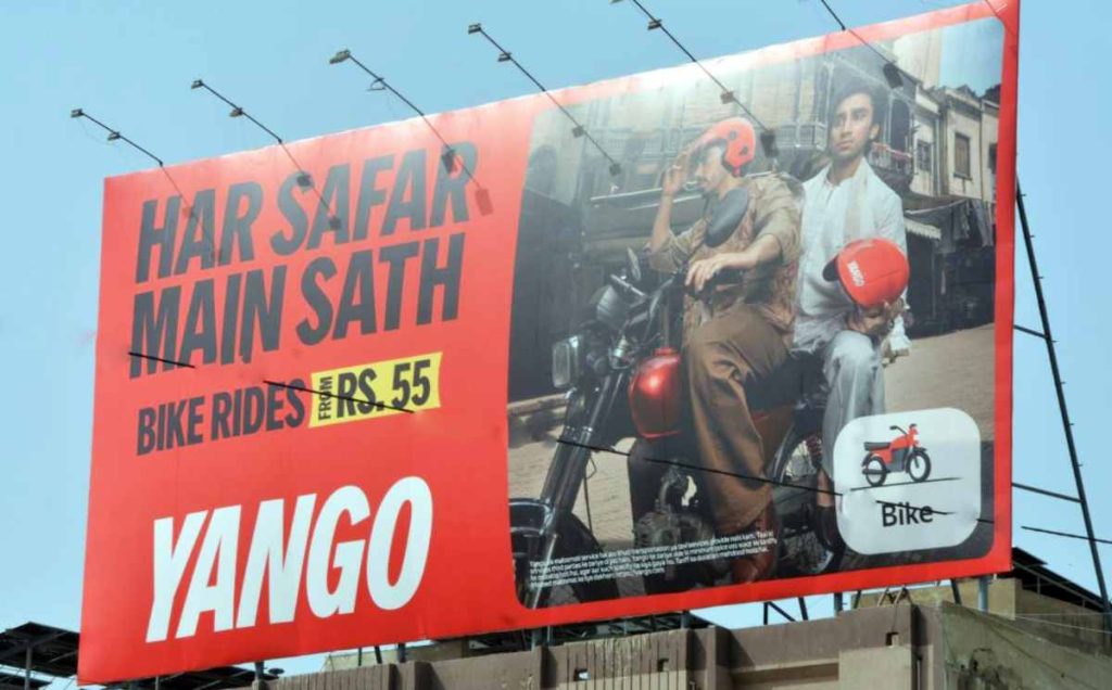
Yango – Budget Rides, Big Impact
In a world of daily commutes, traffic and fuel anxieties, this billboard is a balm. Yango, fast becoming Pakistan’s go-to ride-hailing app, delivers a billboard that does exactly what good outdoor advertising should: it is clear, concise, and instantly communicates the message. Sure, the “up to” discount approach is a familiar tactic for brands, but bike rides for just PKR 55? That is hard to ignore. Even if someone does not open the app to book a ride immediately, chances are they will at least download it. And that, in the world of performance marketing, is already a win.
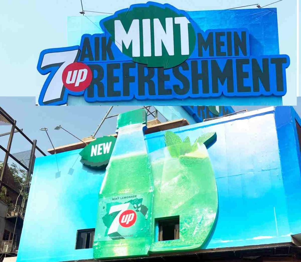
7Up Mint – Refreshing Execution
Oh, to be a billboard that makes people salivate in traffic. It does not just advertise a beverage; it embodies refreshment. The moment you lay eyes on it, it triggers something primal: your mouth waters, your senses sharpen, and suddenly, the only thing that matters is that first, icy sip of mint-laced citrus. The colour palette is masterfully chosen; cool and crisp. It is a visual breeze on a sweltering day. It is summery, bright and delectable. There is no need for forced cleverness here; the product does all the talking. The billboard activates both impulse and need. The message lands loud and clear: you do not just want it, you need to drink it ASAP.
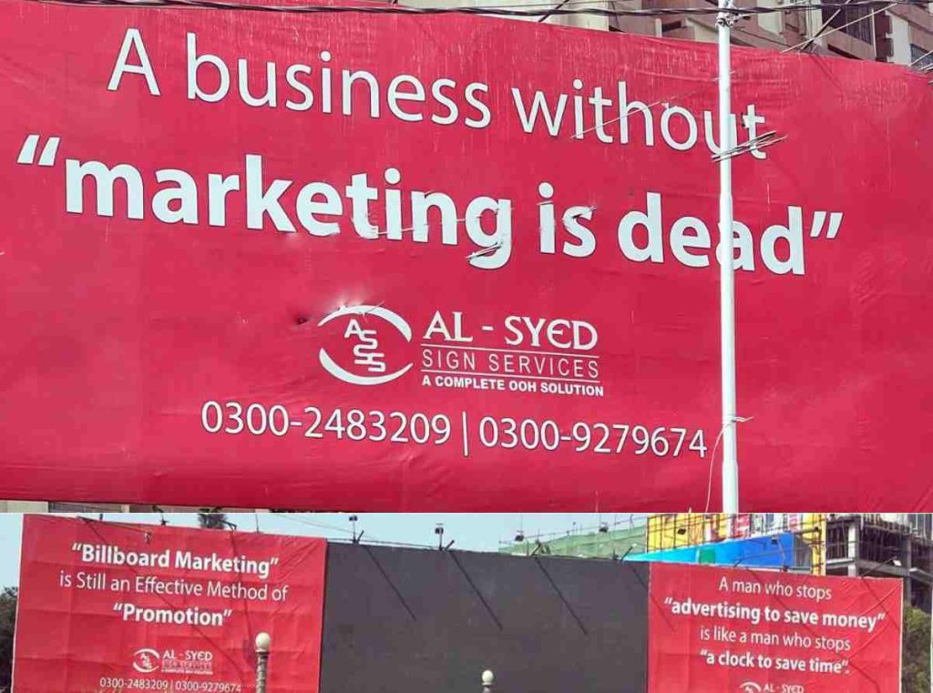
The Billboard That Sells Billboards.
You do not read this ad, you suffer it. The grammar is offensive, the message is unintelligible, and the only thing it inspires is confusion. What are they trying to say? What do they want from us? Sometimes, the best strategy is knowing when not to put something on a billboard. This… is one of those times. In the world of outdoor advertising, you have seconds to capture attention. If your message is grammatically incorrect, visually awkward, and plain confusing, then what even is the point in spending so much money?
“A business without marketing is dead” misuses quotation marks by enclosing a full clause instead of a direct quote, breaks syntax by placing a declarative statement where a noun should be, and fails pragmatically as the intended message, “marketing is essential”, becomes unclear, awkward, and logically disjointed.
The use of quotation marks here is unnecessary and, frankly, bizarre. Are “Billboard Marketing” and “Promotion” being sarcastically quoted? Are they unfamiliar terms? The quotation marks suggest irony or doubt, which completely undermines the credibility of the claim.
There is no need to put “advertising to save money” and “a clock to save time” in quotes. Doing so breaks the metaphor and makes the sentence visually and syntactically awkward. All three billboards suffer from the same fatal flaw: they misunderstand how communication works in public spaces, and that is the irony since they are advertising billboards. This is not branding. It is noise. And in an attention economy, that’s a cardinal sin.
Read More: Billboard Psychology


