

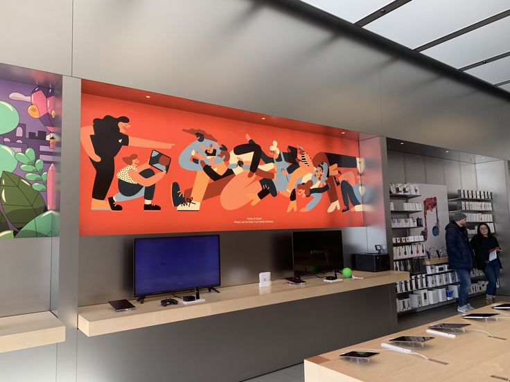
If you’ve ever strolled through an Apple store, those large, softly glowing graphic panels on every wall might have caught your eye. Perhaps you recognized Yukai Du’s vibrant and flat illustrations, reminiscent of candy with sharp silhouettes and rosy skin. This captivating art style, known as Corporate Memphis, has been reshaping storytelling in ways you might not have anticipated.
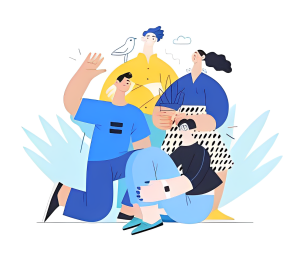
Corporate Memphis burst onto the scene in 2017; initially a space-filler for social media and software products, it has now become a staple in marketing and user interfaces, gracing magazine covers and accompanying website articles. Its solid coloring, geometric shapes, and cartoonish figures with disproportionately lanky limbs have sparked both admiration and criticism.
Corporate Memphis wasn’t just about being easy on the eyes; it was a rebellion against the monotony of traditional corporate design. Gone were the days of dull, gray suits and lifeless pie charts. Instead, bold colors like electric blues, fiery reds, and sunshine yellows took center stage. These hues weren’t just for show; and they were an essential part of the storytelling experience.
Storytelling is nothing without characters, and Corporate Memphis brought them to life in a kaleidoscope of colors. Forget about the grayscale world of traditional corporate communication; in the world of Corporate Memphis, characters wore vibrant suits, had expressive faces, and danced through presentations like they were on Beale Street. It was the art of storytelling with a Southern drawl, where every visual element carried the soulful spirit of the blues. Even the fonts and typography had a rhythm, making every word feel like lyrics in a ballad of business and creativity.
One of the earliest adopters of Corporate Memphis was none other than the social media giant Facebook. In 2017, Facebook introduced Alegria, a design system, illustration, and animation package created by the LA-based design firm BUCK.

Aptly named after the Spanish word for joy, Alegria encapsulates the essence of Corporate Memphis, featuring exaggerated human figures, vibrant color palettes, and whimsical, dance-like movements.
The Alegria design system was a visual feast, showcasing figures with oversized, bendy limbs, small heads, and skin tones in unconventional shades of blue, yellow, and green. This marked a departure from the more conventional and detailed illustrations that preceded it, signaling a shift toward a more simplified, inclusive, and joyous visual language.
Not one to be left behind, Apple, a company synonymous with sleek and minimalist design, embraced the Corporate Memphis style in its own unique way. The tech giant incorporated this whimsical art style into the visual landscape of its retail spaces. Upon entering an Apple store, visitors are greeted by large, softly glowing graphic panels featuring illustrations with candy-like color palettes and sharply defined silhouettes. Illustrators like Yukai Du, whose work adorns Apple stores, have brought the Corporate Memphis style to life within this tech mecca. The illustrations seamlessly blend into the Apple environment, adding a touch of playfulness and vibrancy to the otherwise sleek and modern aesthetic.
The roots of Corporate Memphis are somewhat elusive. Some credit Alice Lee, an independent illustrator who collaborated with Slack, while others attribute its creation to BUCK, the design firm behind Facebook’s Alegria. Drawing parallels to the 80s post-modernist design movement Memphis, this style’s geometric forms and bold color choices resonate with Memphis furniture designs, creating a visual feast for the modern eye.
The trend’s ubiquity was inevitable, aligning with the shift toward minimalistic design seen in phone interfaces and corporate logos. Corporate giants like Apple and Google have fueled the demand for this style, opting for its scalability, simplicity, and cost-effectiveness.
What sets Corporate Memphis apart is its mass appeal, driven by its inclusive illustrations that often feature anthropomorphic aliens. The cheery color palettes and cartoon-like characters evoke a sense of joy and nostalgia, making it a favorite in the realm of social media and policy updates.
But beware the flamboyance, the deliberately oversimplified, aggressively friendly expressions might be a marketing ploy. Placed strategically in subscription terms or privacy agreements, Corporate Memphis could subconsciously lower your guard. Despite potential drawbacks, it offers convenience for graphic designers with its scalability and ease of replication, especially for startups on a budget.
Yet, Corporate Memphis is not a monolith; it allows for creativity and unique interpretations. Artists like Jing Wei and Alex Eben Meyer have added their own flair, showcasing the versatility within the genre.
The journey of Corporate Memphis takes a deeper dive into its roots. The style pays homage to the Memphis Group of the 80s, rejecting traditional notions of “good taste” and embracing flashy, impractical designs. The influence of Mary Blair’s Disney concept art and Charley Harper’s minimalist realism can be traced in its vibrant, whimsical characters.
Corporate Memphis fits snugly into the Millennial Aesthetic, characterized by curved lines, clean backgrounds, and a dreamy color palette. Its dominance began with big tech companies like Facebook, pushing it into the spotlight and sparking debates about its thoughtfulness and intentions.
Corporate Memphis found a breeding ground in the fintech and property sectors, where small companies seeking distinction turned to its quirky, digital-first style as an easier solution than traditional stock imagery. However, this widespread adoption led to a massive homogenization and dulling down of the internet’s visual culture, with accusations that it makes big tech companies appear friendlier and more community-oriented than they might be in reality.
From a design perspective, critics argue that it’s a lazy approach, with tools like Adobe Illustrator enabling easy manipulation of clean lines and colors, resulting in a surge of easily replicable illustrations across various platforms. The critique against Corporate Memphis extends beyond its ubiquity. Designers and critics argue that its worldview is intentionally misleading, depicting a simplified world where problems are already solved, and components seamlessly fit together.
Despite its current bad rap, the meteoric rise and fall of Corporate Memphis provide valuable insights into design trends, public perceptions, corporate culture, and the future of design. Its roots in nostalgia, modernist illustration, and the rejection of skeuomorphism have shaped its trajectory.
However, the style’s oversaturation, lack of specificity, and perceived corporate undertones have led to a backlash. Consumers find it challenging to distinguish between brands, raising questions about effective communication and differentiation in an oversaturated visual marketplace.

As the Corporate Memphis trend begins to wane, designers are pondering what comes next. The focus is shifting towards interface-as-design, with more emphasis on product imagery and real-life use cases. This evolution may provide a fresh perspective, allowing startups and software companies to stand out in a market saturated with visual homogeneity.
So, as we bid farewell to the blue, rubber-limbed figures of Corporate Memphis, we eagerly await the next design wave that will shape the visual landscape in the years to come. Until then, let’s celebrate the quirky journey of an art style that, for a moment, captured our attention and transformed storytelling in its own colorful way.


