
Chocolates are always gifted whenever your foreign friend or family member visits you. I can recall from decades back how such chocolates would be divided between me and my brother. I would eagerly get away with my share while he would wait out. His goal was to tease me later when I had none left. He would, then, peel open the Mars chocolate wrapper and in a suggestive husky voice would repeat the tempting lines from its advertisement back then. “This is one way to look at the Mars bar. This is another!” Following it up with the ingredients list and their attributes, as he would gently have a nibble, with closed eyes suggestive of undergoing unmatched satisfaction, his words coupled with that husky-voiced advertisement recall would be more than enough to kill me within.
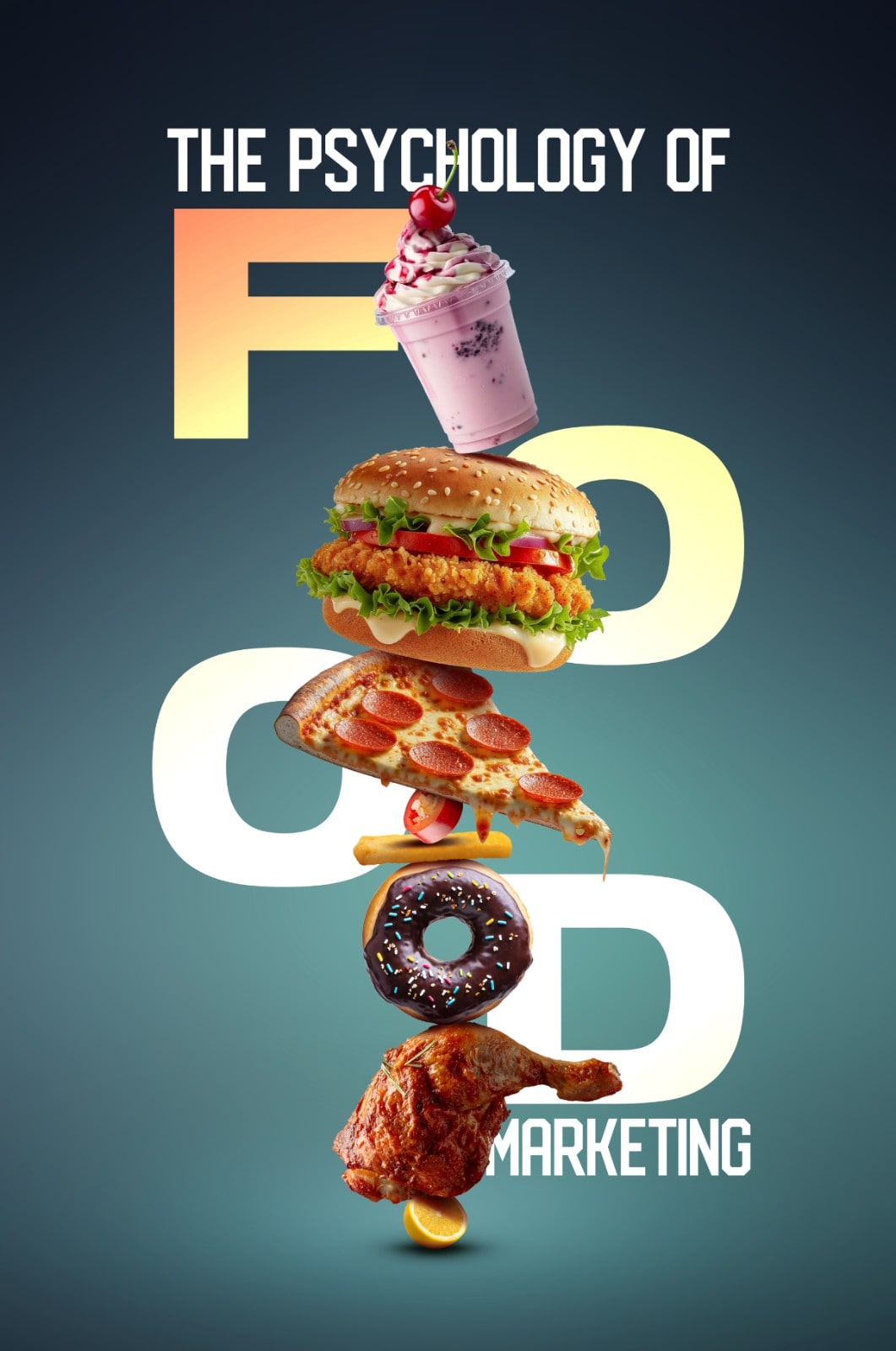
Choosing an enticing combination of colours during branding, catchy taglines, and selecting soul-stirring words in the dialogues during advertisements are all done to lure a major chunk of the target market or their decision-makers into buying the particular food brand. Most of you may have come across the ‘ketchup and mustard’ theory. It means that the food joints, especially the fast-food restaurants would readily opt for red and yellow in combination as the colours for their branding and logo as these are likely to attract more customers. Red is associated with love while yellow is linked with happiness. Just look around and you will hardly find any fast-food joints not using these two primary colours. Orange colour having its roots in red and yellow is also used to showcase enthusiasm. Freshness is more associated with the green shades.
Most of the animated cartoons for young children and toddlers are usually in bright, attractive colours, have fast music, and scenes change quickly which tend to keep them engaged for a longer duration. Almost the same criterion is adopted by food marketers when it comes to impulsive food purchases. Catchy colours making the catch!
One of my teachers, at the Management School, would always say that most food should be showcased in bright attractive colours, and choosing black was a big no-no!
Broadly speaking, the rainbow colours or VIBGYOR range is usually the sought-after choice. Each of these colours impacts human behaviour differently. Similarly, different occasions require different combinations of colours when it comes to food marketing. You may associate more of the reds and golden during Valentine’s Day, while dating, or during marriage ceremonies; but the same choice of colours, however, would be a blunder if a food joint decides to pack a certain snack booked for a majlis or a funeral. You may have seen food outlets coming up with their offers for the mourners during months of Muharram on a black background, whether online through social media platforms or on the roadside banners and posters. Similarly, there is a 360-degree change to the packaging as well to lure in more customers while touching the emotional chord of a potential purchaser.
Shan Foods and National Foods are also neck-to-neck when coming up with Indian family-inspired content for their advertisement. The storylines are more or less the same, huge family living in a mansion and someone cooking food with the particular food brand’s spices that would change the entire world for the family. Usually, these advertisements have a longer duration and predictable plots with a suggestive tagline. While trying to portray themselves as a caring brand, they sometimes overdo it to a nauseating extent. On the contrary, after a below-par, forgetful Dastak Banaspati campaign with Hania Amir dancing along with her friends in a kitchen and attracting some amazing satirical content from CBA Arsalan Naseer; it was their follow-up advertisement that showcased creativity and emotions to another level. With focus on World Food Day and their message of Zero hunger and Food waste beautifully crafted and communicated, they endorsed the concept #SplitthePlate. The advertisement was well thought of – the dialogue delivery, expressions, background song all hit the right chord at the right time. And yes, there were only two decent men who did their job amazingly well and absolutely no clueless girls dancing meaningless aerobics like before!
Fizzy carbonated soft drinks always have a very strong theme and marketing campaign when it comes to targeting their audience.
Keeping aside the ventures like Coke Studio, both the cola giants are globally involved in what we know as cola wars! While 7up currently focusing on young and energetic and Mountain Dew is always focusing on the teens who are, or wanted to be seen as, daring and fearless; it’s PESPI that continually shifts its focus albeit slightly from time to time.
With stronger version of Pepsi being marketed these days, the local cricket heartthrobs Babar Azam and Naseem Shah now advocate the ‘why not meri jaan’ mantra. On the other hand, instead of showcasing any of their own attributes, Sprite touches the emotional chord and gluttony desires by inculcating the idea ‘Mirchi pe lagao Sprite ka tarka’.
They also tried doing what brands like Pampers and TCS achieved – getting the mindshare of the target market! From buying ‘Canbebe kay pampers ka bara packet’ (large sized pack of Canbebe diapers) or a ‘Leopard se parcel TCS kerwalo’ (Dispatch the parcel through Leopard courier), the phrases are both hilarious and awesome from the marketing perspective at the same time. Hence, brand achieving the level that it is considered generic. It is close to what Panadol and Risek achieved in the Paracetamol and Omeprazole segments of the pharmaceutical industry. Sprite, somewhat, tried doing the same when they came up with ‘Apni Pyaas ko Sprite ker’ theme.
Within-hand accessibility and availability of a multitude of options in different cuisines and snacks; there is a growing tendency to shift from highlighting a unique food quality attribute to the time-tested emotional touching points when it comes to branding and advertising food. The ‘jahan maamta wahan Dalda’ mantra will continue to outlive generations. More or less the same principle was adopted by Shan Foods that brought in touchy emotional themes and exchange of dialogues while highlighting the role of women, especially mothers – the decision maker when it comes to making purchases for the kitchen and caring for her family in the best possible manner.
The bright colours would attract the consumers and purchasers to commit them to purchase while roaming with their trolleys in the supermarket. However, that’s not entirely true – Chocolates like Mars and Snickers, some brands of chocolate-filled biscuits, and even the entire Nestle Fruita Vitals range were marketed in black packaging.


