Facebook Instagram Linkedin Twitter
  • Home
  • About Us
  • Interviews
  • Trending
  • Insights
  • Executive Doodles
  • Subscription Plan
  • Others
    • Top Brass
    • Thought Leaders
    • Marketing
    • Agencies
    • Reality Bites
    • Agency Directory
Search
Synergyzer The buzz all over the advertising, marketing & media scene.
  • Home
  • About Us
  • Interviews
  • Trending
  • Insights
  • Executive Doodles
  • Subscription Plan
  • Others
    • Top Brass
    • Thought Leaders
    • Marketing
    • Agencies
    • Reality Bites
    • Agency Directory
Home Brands Walmart Logo – New and Improved?
  • Brands
  • Marketing
  • Trending
  • Trends

Walmart Logo – New and Improved?

By
Ayesha Anjum
-
January 16, 2025
Walmart Font
Walmart Font

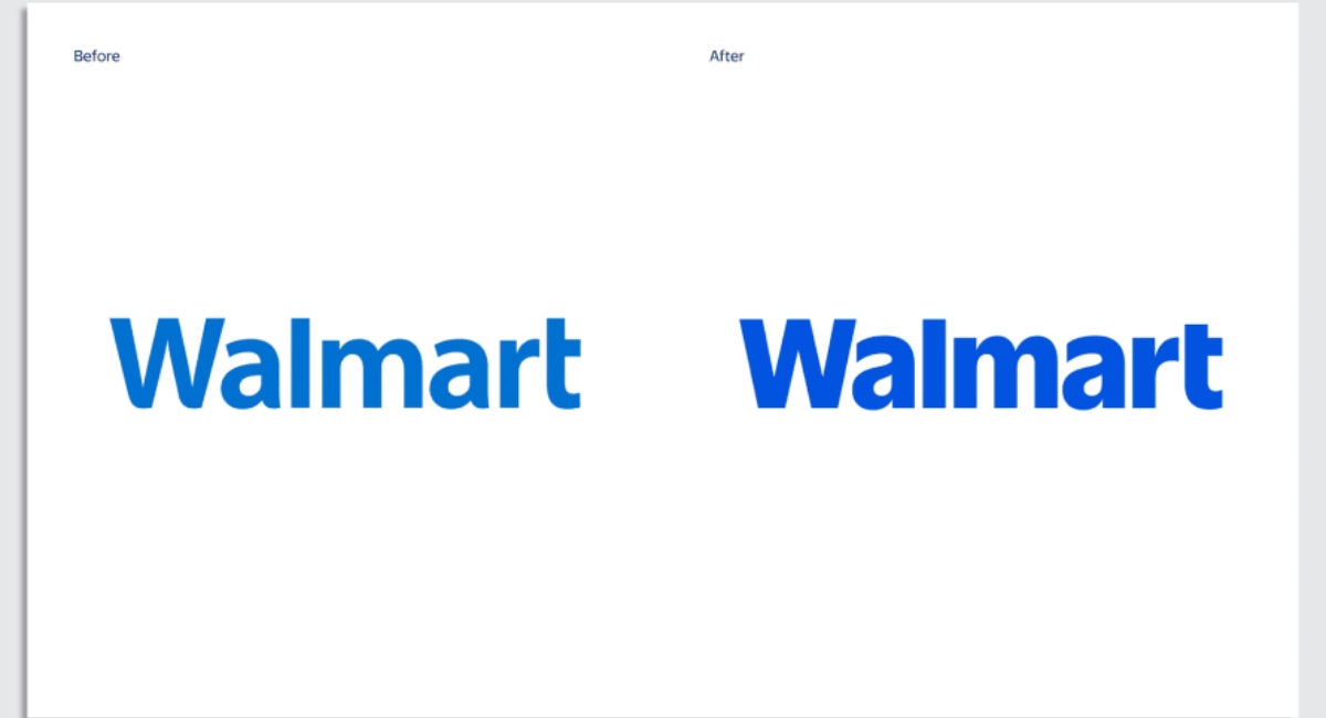
Walmart’s journey began in 1962 with the opening of its first store. Since then has become one of the largest retail chains in the world. Over the past 63 years, Walmart has expanded from 1 store to over 10,000 stores globally. On 13th January 2025, the retail giant unveiled a bold move: a redesigned logo, an update in two decades.

Rebranding is almost always a risky business. It’s a high-stakes gamble, especially for a well-established, well-known brand with an extensive physical presence. Such changes may spark polarising reactions. Customers may or may not embrace the refresh, they might be sceptical fearing it signals a shift in quality or priorities. And most importantly the financial implications with costs extending beyond mere design to include rebranding across stores, packaging, and digital platforms. It’s just not costly but time-consuming as well.

The redesigned logo is Walmart’s vision of blending its heritage with modernity. The wordmark has been updated with a custom font inspired by founder Sam Walton’s classic trucker hat, now bolder, darker and more modern. Walmart’s signature yellow spark has been subtly refined, retaining its role as a symbol of energy and guidance—a beacon that has come to represent the brand’s promise to its customers. The colour palette, anchored by True Blue and Spark Yellow, honours Walmart’s history while embracing a fresh, contemporary aesthetic.

Walmart embraces this evolution, stating its commitment to staying relevant in an ever-changing retail landscape. By balancing innovation with tradition.

As always the people on the internet had some thoughts and like always they didn’t hold back:

Walmart re-did their logo. This is the before and after. I can't believe someone got paid for this.
“Walmart re-did their logo. This is the before and after. I can’t believe someone got paid for this.” – @Keggs719 _ via X.com

Meghan Maureen couldn’t find a difference between the old and the new versions of the logo.

"Minimalist upgrade, zero confusion, I applaud this. You could even hold off for years on changing signage no one would know." - @genuinu / via X.com"Walmart with the face lift, well done." - @Ayrton.Tech _ / via X.com
“Minimalist upgrade, zero confusion, I applaud this. You could even hold off for years on changing signage no one would know.” – @genuinu / via X.com
“Walmart with the facelift, well done.” – @Ayrton.Tech _ / via X.com

Benj, another netizen couldn’t decide whether the upgrade was worth it or not.

"Walmart just unveiled their new logo. It looks the same." - @TiffanyFong_ / via X.com
“Walmart just unveiled their new logo. It looks the same.” – @TiffanyFong_ / via X.com

Tiffany couldn’t believe there was a change at all!

"Huh? It's the same lol Waste of money lol" @heatmck / via X.com
“Huh? It’s the same lol Waste of money lol” @heatmck / via X.com

Another user thought that the new logo was a waste of money.

"So Walmart took their old logo and made it obese. There might be a metaphor there somewhere..." @kristenmag / via X.com
“So Walmart took their old logo and made it obese. There might be a metaphor there somewhere…” @kristenmag / via X.com

Kristen hilariously pointed out that the change may or may not be targeting something else.

Verdict?

The logo change was not needed, especially for change this minute. It does not justify the cost that it would take to revamp and upgrade the entirety of the brand identity of Walmart. Although its not identical, its bolder, brighter and more modern but was it necessary? I think not.

Facebook
Twitter
Pinterest
WhatsApp
    Previous articleIn Conversation with Zurain Imam – Fashion, Trends and Beyond
    Next articleFrom PUMA to PVMA: The Genius Behind the Rebranding Stunt
    Ayesha Anjum
    Ayesha Anjum
    Ayesha Anjum is an editorial assistant at Synergyzer, with an English Literature degree and a tendency to overanalyse the universe, she’s set out on a quest in the world of journalism. She approaches everything in life with the intensity of someone who’s been triple-dared. Ayesha is a self-proclaimed connoisseur of existential dread, while most kids were out playing, she was inside, furiously scribbling poetry about the fleeting nature of life and the emotional complexities of losing her favourite toy. She’s here to make you think “Wow, she’s funny, but is she okay?” one caffeine-induced anxiety spiral at a time, because sometimes the best stories come from the messy, weird experiences of just being human.
    The Buzz All Over the Advertising, Marketing & Media Scene – Where Ideas Ignite and Brands Shine.

    Useful Links

    • Home
    • Interview
    • Trending
    • Insight
    • Contact us

    Popular Books

    • Executive Doodle
    • Globetrotting Travel Alchemist
    • Shifting Dynamics of Pakistani Market
    • The Political Pizzazz
    • Go Green

    Address

    • House # 69 – B, Sindhi Muslim Cooperative Housing Society, Off Shara-e-Faisal, Karachi-74400.
    • +92-21-34324741-4
    • info@synergyzer.com
    Copyright © 2025 Synergyzer | Powered by Synergyzer