
Karachi’s billboards are more than just roadside distractions—they’re bold statements and sometimes baffling blunders. From neon spectacles to poetic taglines, this article dives into the psychology behind OOH Advertising, critiquing the hits and misses that colour our cityscape.
You may find billboards as the silent street-side salesperson of the marketing world. From splashy skyscraper wraps to neon novelties, these larger-than-life ads battle for a few seconds of our fleeting attention as we hustle through life, especially in a big bustling city like Karachi. It’s always a wonder to me, what is it about billboards that makes them more than just a background blur? Why do some billboards blend into the background like wallpaper, while others practically demand a full neck swivel as I cruise by? As I dug deeper into this, I realised it’s all about psychology.
Visual impact, emotional resonance, and a touch of simplicity form the holy trinity of effective out-of-home advertising (OOH), the marketing industry’s way of saying billboards more professionally. Let’s stroll through the streets of Karachi and critique some eye-catching, (either in shock or delight) OOH pieces around our cityscapes.
A Colourful Clash of Creativity
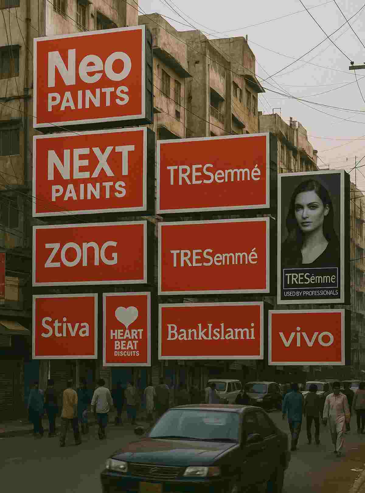
Neo Paints doesn’t just advertise, it bursts onto the scene like a firework finale. The vibrant hues, and the tagline “Colour Your Life” is as straightforward as it is uplifting. The paint splashes on the advertisement practically scream creativity – you’re the painter, and your home is your masterpiece. It’s bold, fun, and refreshingly uncomplicated; a real showstopper in my opinion.

Next Paints, on the other hand, feels like it’s still mixing its colours. The muted tones, cluttered design, and questionable font choices bury its message faster than a paint spill. Neo is the Pop anthem of billboards, while Next is stuck humming elevator music. Lesson? Go bold or go home.

Text Overload Trouble
Let’s leave the essays to the other mediums! Zebjee’s weaves too many words into a tiny space, leaving viewers tangled in text. It’s like squinting at fine-print on the go. It’s not only overwhelming but also dangerous.

DHA Karachi’s ad is distracting, and not eye-catching, it’s quite a thin line, with payment deadlines and percentages that scream ‘accountant’ instead of ‘adventurous.’ Both need a good snip and trim, and a touch of that design magic, the golden rule of OOH? Don’t make it a puzzle. A billboard should be a mic drop, not a university lecture.

Rave on the Road
Karachi isn’t called the City of Lights for nothing. If billboards could boogie, this neon masterpiece would be doing the moonwalk.
“Let’s Get Digital” beams boldly, while the bright green and pink hues throw a visual rave for your retinas. It’s a party for your eyes; makes you stop and stare. Zong nails it: when in doubt, turn up the lights!

Flipping Hair and Turning Heads
Now this one’s a head-turner with its promise of “3x Increased Strength,” TRESemmé marries logic with lusciousness.
The sleek black-and-gold design oozes sophistication, like the little black dress of billboards. It’s a beauty ad that says, “You’re strong, and so should your hair.” It’s sleek, it’s chic, and it’s exactly how you sell hair care with flair.

Sweet Simplicity
Stiva serves up a spoonful of simplicity with its zero-sugar, zero-calorie oath. Green always says one thing and one thing only: health, while the massive “0” appeals to your diet-conscious dreams.
It’s a sugar-free serenade for calorie counters. While the design leaves room for a bit more creativity, it’s still sweet, simple, and gets the job done.

Spreading Smiles, One Bite at a Time
This is what we call a heart-warming pop of positivity. With a cheerful model, playful purple tones, and a catchy rhyme, everyone loves rhymes!
“Bite lo, Light lo,” this Peek Freans ad knows how to spread smiles. It’s like a hug in the form of a billboard: bold, bubbly, and impossible to ignore.

Skyline Showstopper or Oversized Overkill?
Vivo’s building wrap is the King Kong of OOH—big, bold, and impossible to miss. It’s a tech titan on the skyline, but does size really matter? Perhaps, if you look at it without context, the sheer scale risks losing the finer details, making it more spectacle than a story. However, location is everything.
Placed right smack dab in the middle of Karachi’s bustling mobile market in Saddar, this billboard beckons to every potential buyer like a moth to a flame. Smart move, Vivo!

Inclusive Visions, Wider Connections
Lately, this one has been catching my eye all over the city. “Saving Humanity from Riba” quite literally takes the high road, both in messaging and placement. It’s thought-provoking and heavy on cultural cues.
I do appreciate the inclusive touch by BankIslami focussing on “Humanity” over “Ummah” and visually representing various religions, making an earnest effort to reach a wider audience.

The Billboard Balancing Act
Billboards aren’t just ads, they’re urban art, emotional triggers, and memory markers. The best OOH campaigns understand the psychology of attention: keep it simple, strike an emotional chord, and make a bold statement. So, the next time you’re stuck in traffic, look around. That silent salesperson on the street corner might just have something brilliant (or bewildering) to say.


